
4 tips to impactful story-telling using data20 Feb 2017
The following post was originally written for Inside FMCG Magazine.
Did you enjoy statistics and maths at school? If so, congratulations, but be aware that, like me, you’re in the minority. As a maths graduate, I constantly have to remind myself that the nerdy spreadsheets and bar charts that I was brought up on are, in fact, a complete turn-off to the vast majority of colleagues and clients alike.
And yet we are surrounded by the need to understand data in our everyday lives: how are sales progressing, what do we know about our consumers’ behaviours, what are the trends in our industry over time: data, data, and more data.
So is the answer simply to turn away, and operate with your gut feel? Of course not, the answer is really to get clever about how you show your data, how you help colleagues visualise and understand it in their minds, whether they are data experts or not.
Painting a simple and clear picture from your data is fast becoming critical to winning over your clients or colleagues to your story. Here are 4 practical tips that I have found, over 20 years in the insights world, to be impactful in delivering the message contained in the numbers.
Tip 1: Augment your data with Reality
Data without context is frankly, well, divorced from reality! But when it is overlaid on a picture of the real world, for example the store or shelf that we are referring to, it somehow seems a lot more relevant. Diagram 1 uses store video camera footage, overlaid with the ‘data’ – in this case traffic numbers – to summarise where the busy pathways are in store. By placing the two bits of information together, i.e. a picture of the real store and a summary of the statistics, the reader is better placed to understand exactly what is happening, and to make judgements about what is happening and why. It is the augmentation with reality that provides the reader a context to understand that store’s situation & to make sense of the numbers.
Diagram 1

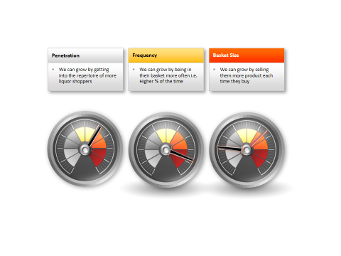
Tip 2: Try one of the new Visualisation mechanics
Just as consumers gradually get bored of the same advert over time, or the same price-promotion running endlessly, so we have all become a little tired of seeing the bar chart!
The commonly available data tools available through Microsoft Word, PowerPoint and Excel – bar charts, line charts, pie charts, scatterplots and so on – are ubiquitous, that’s their strength. But at the same time they’re also easy for the reader to tune out from, having been seen countless times before by the reader – often with the reaction of “oh no, here we go, more data”. Not a reaction that will engage and inspire our audience.
By simply changing the visual to being something that is unusual, or particularly aligned to the category (See Diagram 2, a ‘speedometer’ to reflect how quickly the business is moving on its shopper metrics), my experience is that the reader will engage and involve in greater depth.
There are a myriad of highly engaging template designs to pour through as alternatives to bar charts, simply Google ‘presentation templates’ for a list of potential resources, my Bible is presentationload.com.
Diagram 2
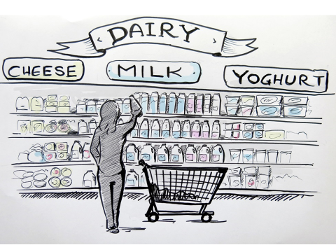
Tip 3: Get a Creative on the job
“A picture is worth a thousand words”, so the saying goes. Well, it may be worth a thousand (or more) data figures as well. Most corporate managers have limited time and therefore band-width to absorb information. And many of these people are more ‘visual’ than ‘numeric’ in how they understand the world around them.
Which means that, while data should provide the foundation or evidence to a ‘story’, it is often worth getting a creative person – an illustrator, animator, videographer, an artist – to provide a picture of what the story’s outcome or ending is supposed to look like.
Presentations of insight or data are rather like a ’30-second advert’, they need to convey a key story in a short time. And as any award-winning ad will show, that involves getting creative input to ‘engage’ the viewer sufficiently to get the message across.
I’ve found the use of an illustrator particularly helpful. Rather than drowning the reader in bar charts showing what dairy categories should be adjacent to one another, an illustration of what the area might look like in store, supported by a few key figures, was more impactful in getting the message across to a customer (see Diagram 3).
Freelance illustrators and graphic designers are easy to find, but of course you need to find one that ‘understands you’, and can create images that ‘fit with how you want to convey the story’. They’re worth their weight in gold in helping bring to life the ‘so what’ from your data.
Diagram 3
Tip 4: Link your story to a Real Person
Understanding ‘data’ doesn’t come naturally to most of us. But we do love ‘stories’. We trawl through social media and mainstream media every day, and look for stories. What’s the difference? Well, data is an inanimate ‘thing’, whilst a story about a real person evokes ‘emotions’, we ‘relate to the story’, we have ‘empathy with the character’.
So, how can you convert your ‘data’ to a ‘real life story’? Well, the simplest method is through consumer or shopper self-recorded videos, which increasingly shoppers are able to capture via their mobile. Provided the consumer or shopper’s feedback is ‘on cue’ to the story being pitched, they’re a great way to get your point across in an engaging way that is both visual and aural.
Several providers, both in Australia and globally, now offer this service, including WatchMeThink, Qualvu, Voxpopme, Nail Biter and more.
As per the diagram shown, simply hearing from a ‘real life consumer or shopper’ is so much easier to understand than a pile of data charts. If the message is supported by the robustness of the data, then use the short feedback from a real person as a way to convey your message.
Diagram 4

Follow these 4 simple tips, and you can be sure that your audience will appreciate your creativity, and perhaps even want to delve into the numbers that sit beneath your story!
No Comments